Accessible Data Visualizations

Accessible data visualizations

Today’s blog post explores accessible data visualizations, one of the highest-risk areas for accessibility in any organization.

This post explains what counts as a data visualization, why these visuals create accessibility risks, which WCAG requirements apply, and how to use a repeatable five-step workflow to fix them.

Video Guide

What Data Visualizations Include and Why Accessibility Matters

A data visualization is any visual presentation of data that communicates a result, comparison, pattern, or trend. The category includes more than standard bar charts and line graphs.

Common data visualizations

  • Business intelligence dashboards
  • KPI cards and large-number callouts
  • Maps
  • Infographics
  • Tables saved as images
  • Sparklines
  • Gauges and dials
  • Trend indicators
  • Donut and pie charts

Each element communicates meaning and needs an accessible equivalent. Labels, descriptions, structured data, and sufficient contrast help users understand the information without relying entirely on sight.

Data visualizations create a high accessibility risk because they often combine many figures and comparisons in one visual object. When a team exports a dashboard as a flat image, a screen reader may announce only “image,” leaving out every KPI, trend, and regional comparison.

Low-vision users may face a different barrier when charts distinguish data only through color. If two lines or status indicators look too similar, the intended comparison can disappear.

These barriers can prevent users from following reports, participating in meetings, and contributing to decisions. Accessible text, direct labels, stronger contrast, and structured data tables give users a reliable path to the same information.

The Legal and Standards Context

Organizations that publish data visualizations may need to follow WCAG and other digital accessibility requirements.

  • Text alternatives, WCAG 1.1.1: Describe the visualization’s purpose and key findings.
  • Information and relationships, WCAG 1.3.1: Provide structured data, such as an accessible table.
  • Use of color, WCAG 1.4.1: Support color with labels, patterns, shapes, or symbols.
  • Contrast, WCAG 1.4.3 and 1.4.11: Maintain sufficient contrast for text and meaningful graphical elements.

Five Common Accessibility Failures

These are the top 5 data visualization accessibility failures that come across my desk:

  • Missing or unhelpful alternative text: Generic labels such as “image” or “chart” do not explain the data. Summarize the main findings and provide more detail nearby.
  • Color-only encoding: Do not rely on colors such as red and green to communicate status. Add labels, patterns, shapes, or icons.
  • Low contrast: Use sufficient contrast for labels, data series, lines, and controls.
  • KPI values presented as images: Display metrics as real, selectable text with clear labels and trend information.
  • No accessible data table: Provide a structured table with clear headings, accurate values, and written trends.

A Five-Step Workflow for Accessible Data Visualizations

Use the following workflow for any dashboard, chart, or report.

  • Identify the components: Review titles, KPI cards, charts, legends, filters, notes, and data sources separately.
  • Write alt text: Summarize the key data and provide longer descriptions or data tables for added detail.
  • Fix color and contrast issues: Add labels, patterns, shapes, or icons, and ensure all meaningful elements have sufficient contrast.
  • Add a real data table: Present the same categories, values, and trends in a structured, accessible format.
  • Test with a screen reader: Confirm that labels, values, trends, headings, controls, and reading order make sense.

Applying the Workflow (Live example)

This is the example we worked through in the companion video.

Consider a quarterly program dashboard exported as a single image, that contains three KPI cards, a regional bar chart, and a donut chart.
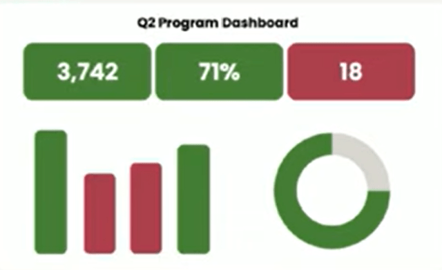
The original version uses the alternative text “dashboard.” It relies on red and green to show status. The charts have no value labels. The report provides no data table.

Rewrite the Text Alternative

Replace the generic label with:

“Q2 program dashboard: 3,742 enrollments, 71% completed on time, and 18 participants at risk. A detailed data table follows.”

This version communicates the main figures and directs users to more detail.

Improve the Visual Encoding

Replace the red and green scheme with a colorblind-safe palette.

Add a value label to every bar. Mark the leading region with a pattern and a text label. Pair every trend arrow with a written direction.

Convert KPI Cards to Real Text

Present each KPI as real text:

  • Total enrollment: 3,742
  • On-time completion rate: 71%
  • At-risk participants: 18

Programmatically connect each value to its label so assistive technology announces the full meaning.

Add the Underlying Data

Place a real table below the dashboard.

Include every KPI, regional total, percentage, trend, and status shown in the visual. Let users move through the table by row or column.
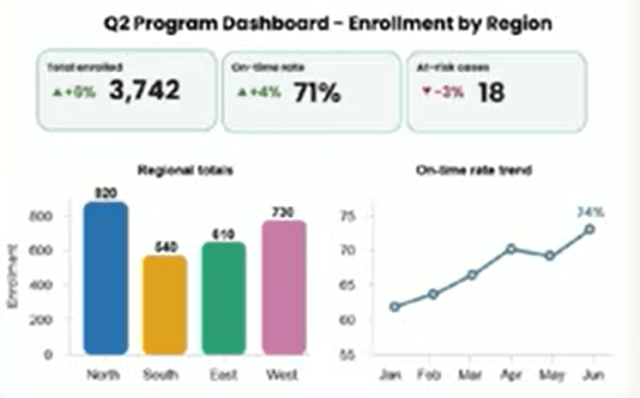
Verify the Experience

Test the finished report with a screen reader.

A user should hear the title, reporting period, KPI values, trend directions, chart summary, and table headings in a useful order.

The user should receive the data itself, rather than a single generic image label.

Tips to Write Better Alternative Text for Charts

Focus on the chart’s purpose rather than its appearance.

A weak description says: “Bar chart with four blue bars.”

A useful description says: “Regional enrollment was highest in the North at 1,120 and lowest in the West at 792.”

The second description communicates the comparison that matters.

For complex charts, use a layered approach:

  1. Write a short summary of the main insight.
  2. Add a longer description for important trends.
  3. Provide a structured data table with exact values.

This approach gives users the right level of detail without forcing all information into one long text alternative.

Combine Accessible Design With a Consistent Workflow

Charts help users recognize patterns quickly, while data tables provide exact values. Labels, descriptions, strong contrast, and direct annotations make the same information easier to understand for screen reader users, people with low vision, and anyone viewing the report on different devices or displays.

Organizations can reduce accessibility risks by building these practices into their standard reporting process. Create reusable guidance for:

  • Dashboard templates
  • Chart color palettes
  • KPI components
  • Text alternatives
  • Accessible data tables
  • Contrast checks
  • Exported reports
  • Screen reader testing

Assign clear responsibilities across the team. Designers can focus on visual clarity and color use. Developers can build semantic structure and keyboard support. Data analysts can verify that descriptions and tables match the source data. Accessibility specialists can test the finished report with assistive technology.

A Practical Review Checklist

Before publishing a visualization, confirm that:

  • Each meaningful chart has useful alternative text.
  • The main finding appears in text.
  • Exact values appear in a structured table.
  • KPI values use real text.
  • Trend indicators include written labels.
  • Color does not carry meaning by itself.
  • Text and graphical elements meet contrast requirements.
  • The reading order makes sense.
  • Table headings connect to the correct data.
  • Keyboard users can operate interactive controls.
  • A screen reader can access the key information.
  • The chart and table contain matching data.
  • Exported versions preserve accessibility.

Accessible data visualization gives every user a clear path to the information, comparisons, and decisions that the visual communicates.

Let me be your champion for inclusion. I offer tailored solutions (and self-paced courses!) to ensure your documents meet and exceed compliance expectations. For more detailed insights, tutorials, and in-depth discussions on accessibility and related topics, don’t forget to check out my YouTube channel: The Accessibility Guy on YouTube. Subscribe for regular updates!

Related Articles

Responses

Leave a Reply

Discover more from The Accessibility Guy

Subscribe now to keep reading and get access to the full archive.

Continue reading